In this post we will use ggplot to create some nice and clean looking graphs. How to colour points by groups, edit both the x and y axis, clean the legend and change and customise various aspects of the graph.
First of all we load the mtcars data set. Then we want to see what is contained within the data set and also view what type of data each variable is.
The raw code is also available from my github, see:
https://github.com/granger89/SCALEITUP/blob/master/graphs%20in%20ggplot2
library(ggplot2)
cars <- mtcars
cars
str(cars)
We can see there is no categorical variable. We are going to create one which we will use for plotting we are going to create two; one for the make of car and another for its weight class.
cars$car_type <- rownames(cars)
Next we use summary to help us when deciding upon the thresholds.
summary(cars$wt)
cars$wt_class <- NA
indx <- cars$wt<2.5
cars[indx, "wt_class"] <- "light"
indx <- cars$wt>=2.5 & cars$wt<3.4
cars[indx, "wt_class"] <- "medium"
indx <- cars$wt>=3.4
cars[indx, "wt_class"] <- "heavy"
We now have the data frame in the correct format we want for plotting
str(cars)The following code gives us a simple plot of two variables mpg (x-axis) and hp (y-axis) using the dataset cars.
ggplot(cars) +
geom_point(aes(mpg, hp))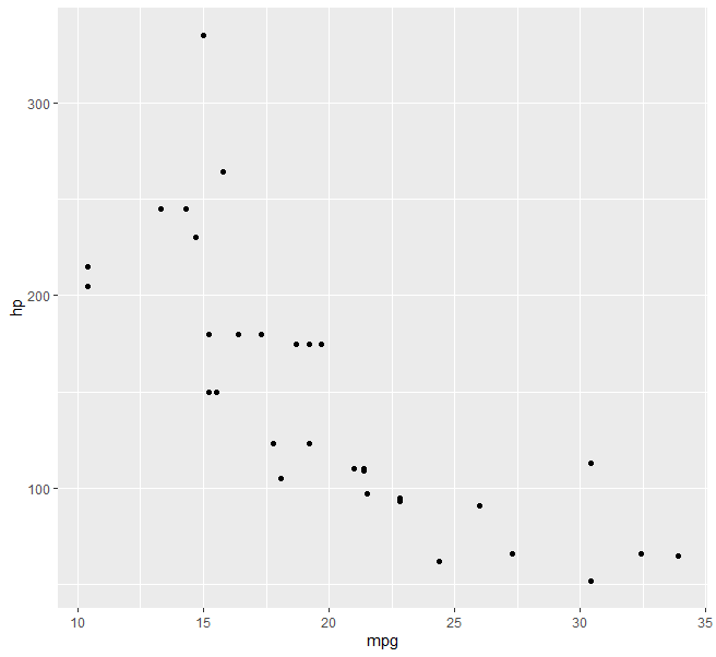
We now introduce a third variable. We can change the point shapes using a categorical variable. For this we use the weight class variable we created earlier.
ggplot(cars, aes(x=mpg, y=hp, group=wt_class))+
geom_point(aes(shape=wt_class), size=2, alpha=1)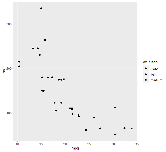
Now we have the graph we next steps involved editing the axes, legend, title and background so that we get a cleaner graph.
Editing the axes and background
Firstly we will import new fonts.
library(gridExtra)
library(extrafont)
library(ggthemes) # Load
fonts()
windowsFonts("Arial" = windowsFont("Arial"))
windowsFonts("Times New Roman" = windowsFont("Times New Roman"))
windowsFonts("Goudy Stout" = windowsFont("Goudy Stout"))
Give the plot a white background and change the fonts
ggplot(cars, aes(x=mpg, y=hp, group=wt_class))+
geom_point(aes(shape=wt_class), size=2, alpha=1)+
theme_bw()+
theme(panel.background = element_rect(fill = "white", colour = "white"))+
theme(axis.text=element_text(size=11, family="Arial"),axis.title=element_text(size=12,face="bold", family="Arial"))+
theme(panel.grid=element_line(color = "grey80"))
Change the x and y axis names and also remove spacing around the origin. We can also change the limits of the x and y axes.
ggplot(cars, aes(x=mpg, y=hp, group=wt_class))+
geom_point(aes(shape=wt_class), size=2, alpha=1)+
theme_bw()+
theme(panel.background = element_rect(fill = "white", colour = "white"))+
theme(axis.text=element_text(size=11, family="Arial"),axis.title=element_text(size=12,face="bold", family="Arial"))+
theme(panel.grid=element_line(color = "grey80")) +
labs(x = "Miles per Gallon (mpg)", y = "Horse Power (HP)" )+
labs(title = "Cars power, weight and fuel economy")+
scale_x_continuous(limits = c(0,35), expand = c(0, 0)) +
scale_y_continuous(limits = c(0,350), expand = c(0, 0))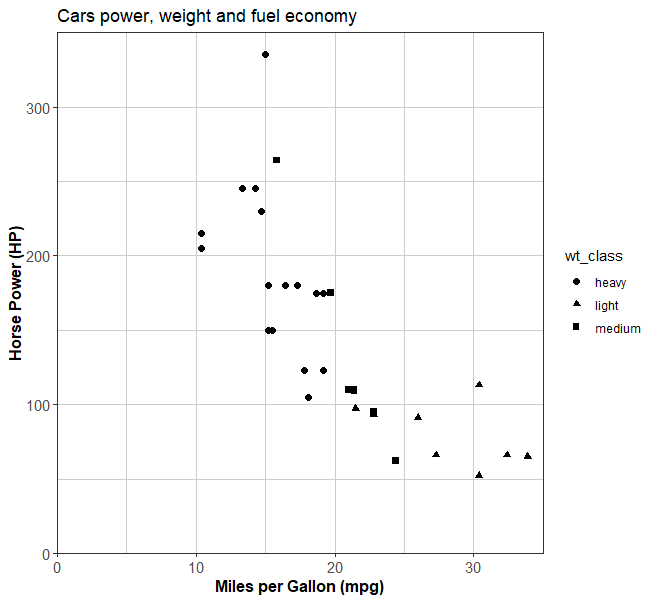
Fixing the legend
One thing I would like to fix is the legend as it does not look that pleasant. I would like the first letters to be capitals and ‘wt_class’ does not explain what the values show.
scale_shape_manual(values=c(1, 2, 3), name = "Weight Group", breaks=c("heavy","medium","light"), labels=c("Heavy >3.4 Tons", "Medium 2.5-3.4 Tons", "Light <2.5 Tons"))To explain this code, the values are the type of shapes used to represent the different classes. See the link for what the different values mean.
Next ‘name’ is the title of the legend.
‘breaks’ are the different classes. Once we know the values we can then put them in whatever order we want. (“heavy”,”medium”,”light”) or (“light”,”medium”,”heavy”) . That is the order they appear in the legend.
Next we use labels to replace the raw data values with whatever value we want.
http://www.sthda.com/english/wiki/ggplot2-point-shapes
ggplot(cars, aes(x=mpg, y=hp, group=wt_class))+
   geom_point(aes(shape=wt_class), size=2, alpha=1)+
   theme_bw()+
   theme(panel.background = element_rect(fill = "white", colour = "white"))+
   theme(axis.text=element_text(size=11, family="Arial"),axis.title=element_text(size=12,face="bold", family="Arial"))+
   theme(panel.grid=element_line(color = "grey80")) +
   labs(x = "Miles per Gallon (mpg)", y = "Horse Power (HP)" )+
   labs(title = "Cars power, weight and fuel economy")+
   scale_x_continuous(limits = c(0,35), expand = c(0, 0)) +
   scale_y_continuous(limits = c(0,350), expand = c(0, 0))+
   scale_shape_manual(values=c(1, 2, 3), name = "Weight Group",
                      breaks=c("heavy","medium","light"),
                      labels=c("Heavy >3.4 Tons", "Medium 2.5-3.4 Tons", "Light <2.5 Tons"))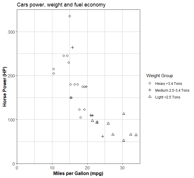
Finally we can position the legend. Currently it is squeezing the size of the plot area. We are likeyl to have some empty space where we can place it. The position varies on the x and y axes from 0 to 1. So how about we place it at 0.2 on the x-axis and 0.2 on the y-axis. I’ve also given it a border and made the background white.
ggplot(cars, aes(x=mpg, y=hp, group=wt_class))+
   geom_point(aes(shape=wt_class), size=2, alpha=1)+
   theme_bw()+
   theme(panel.background = element_rect(fill = "white", colour = "white"))+
   theme(axis.text=element_text(size=11, family="Arial"),axis.title=element_text(size=12,face="bold", family="Arial"))+
   theme(panel.grid=element_line(color = "grey80")) +
   labs(x = "Miles per Gallon (mpg)", y = "Horse Power (HP)" )+
   labs(title = "Cars power, weight and fuel economy")+
   scale_x_continuous(limits = c(0,35), expand = c(0, 0)) +
   scale_y_continuous(limits = c(0,350), expand = c(0, 0))+
   scale_shape_manual(values=c(1, 2, 3), name = "Weight Group",
                      breaks=c("heavy","medium","light"),
                      labels=c("Heavy >3.4 Tons", "Medium 2.5-3.4 Tons", "Light <2.5 Tons"))+
   theme(legend.position=c(0.2,0.2))+
   theme(legend.text.align = 0)+
   theme(legend.title=element_text(size=10))+
   theme(legend.text=element_text(size=10))+
   theme(legend.background = element_rect(colour = 'black', fill = 'white', size = 1, linetype='solid'))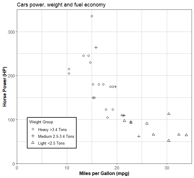
Vary size by value of variable
Finally lets introduce a fourth variable. Instead of all points having a fixed size let us vary the size based on the number of gears.
ggplot(cars, aes(x=mpg, y=hp, group=wt_class, size=gear))+
geom_point(aes(shape=wt_class), alpha=1)+
theme_bw()+
theme(panel.background = element_rect(fill = "white", colour = "white"))+
theme(axis.text=element_text(size=11, family="Arial"),axis.title=element_text(size=12,face="bold", family="Arial"))+
theme(panel.grid=element_line(color = "grey80")) +
labs(x = "Miles per Gallon (mpg)", y = "Horse Power (HP)" )+
labs(title = "Cars power, weight and fuel economy")+
scale_x_continuous(limits = c(0,35), expand = c(0, 0)) +
scale_y_continuous(limits = c(0,350), expand = c(0, 0))+
scale_shape_manual(values=c(1, 2, 3), name = "Weight Group",
breaks=c("heavy","medium","light"),
labels=c("Heavy >3.4 Tons", "Medium 2.5-3.4 Tons", "Light <2.5 Tons"))+
theme(legend.position=c(0.2,0.3))+
theme(legend.text.align = 0)+
theme(legend.title=element_text(size=10))+
theme(legend.text=element_text(size=10))+
theme(legend.background = element_rect(colour = 'black', fill = 'white', size = 1, linetype='solid'))+
scale_size_continuous(range = c(3,5),
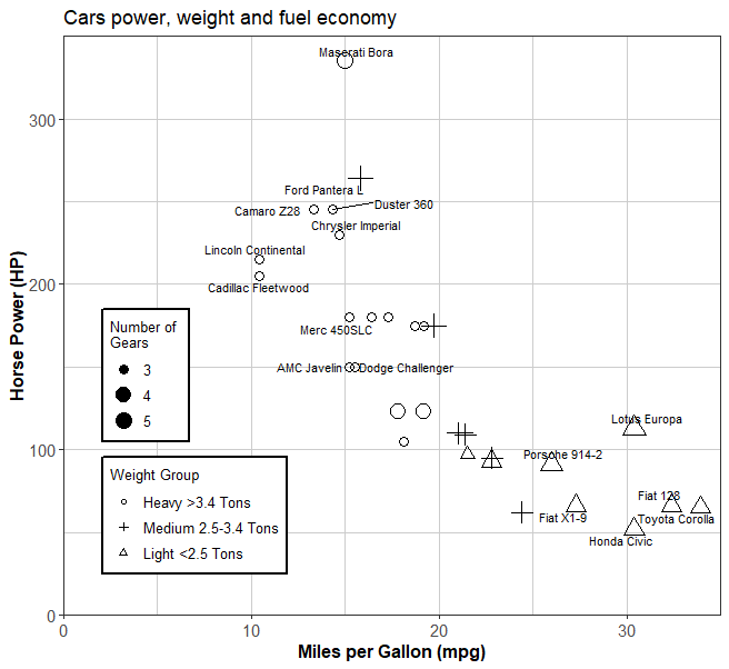
breaks= c(3,4,5), name="Number of \nGears")Label specific points
Also I would like to label the outliers at the upper and lower end. For this we use ggrepel
library(ggrepel)
ggplot(cars, aes(x=mpg, y=hp, group=wt_class, size=gear))+
   geom_point(aes(shape=wt_class), alpha=1)+
   theme_bw()+
   theme(panel.background = element_rect(fill = "white", colour = "white"))+
   theme(axis.text=element_text(size=11, family="Arial"),axis.title=element_text(size=12,face="bold", family="Arial"))+
   theme(panel.grid=element_line(color = "grey80")) +
   labs(x = "Miles per Gallon (mpg)", y = "Horse Power (HP)" )+
   labs(title = "Cars power, weight and fuel economy")+
   scale_x_continuous(limits = c(0,35), expand = c(0, 0)) +
   scale_y_continuous(limits = c(0,350), expand = c(0, 0))+
   scale_shape_manual(values=c(1, 2, 3), name = "Weight Group",
                      breaks=c("heavy","medium","light"),
                      labels=c("Heavy >3.4 Tons", "Medium 2.5-3.4 Tons", "Light <2.5 Tons"))+   theme(legend.position=c(0.2,0.3))+   theme(legend.text.align = 0)+   theme(legend.title=element_text(size=10))+   theme(legend.text=element_text(size=10))+   theme(legend.background = element_rect(colour = 'black', fill = 'white', size = 1, linetype='solid'))+   scale_size_continuous(range = c(3,5),                           breaks= c(3,4,5), name="Number of \nGears")+   labs(size="Number of Gears")+   geom_text_repel(data = subset(cars, mpg > 25 | mpg <16), size=3,aes(label = car_type))
For other customisable options please refer to the ggplot2 documentation which is excellent at explaining how to add further options.